- Reorganizing GGST 2.0's Character Select -
Intro
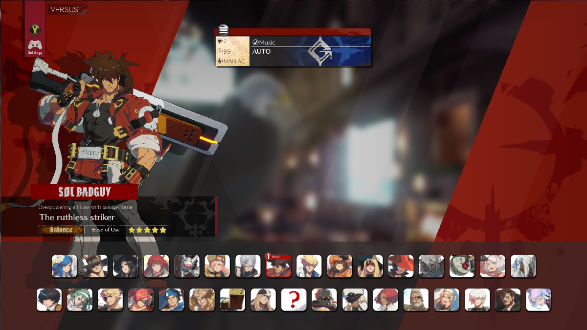
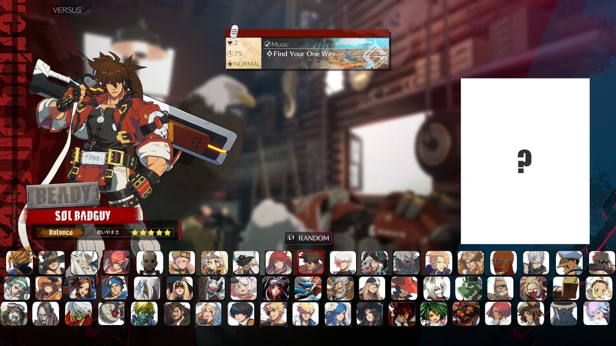
Alert! Alert! ArcSys just released the first in-game image of 2.0! Yeah it's just the character select, but honestly there is still a lot to talk about here. They changed more than it seems at a first glance...
- What's New? -
What's New?
To start off, here is a comparison between the new and old character selects:
Now for the differences, roughly organized into types:
-- LAYOUT -----------------------------------------------------------------------------------------------
The character grid is now three rows instead of two. This also means there is way more horizontal space to be filled.
The order of characters has changed from 1/2 of Season 4 -> 1/2 of Season 3 -> 1/2 of Season 2 -> 1/2 of Season 1 -> Base Roster -> 1/2 of Season 1 -> 1/2 of Season 2 -> 1/2 of Season 3 -> 1/2 of Season 4 to Season 4 -> Season 2 -> Base Roster -> Season 1 -> Season 3.
The random button has been changed from a character spot to using the L1 button.
Character titles / descriptions have been moved from their text box thing to the side of the screen (probably scrolling, since we can't see the full "Overpower all foes with savage force" thing in this screenshot).
The controller settings button is just gone.
-- VISUALS -----------------------------------------------------------------------------------------------
The red diagonal border on the left now mirrors the one on the right, both are transparent, and both are darker. The right one is also blue now, and there are chains across the bottom part of both.
The background seems to take place in Sol's workshop instead of some unknown study(??). It is also much less blurry. There is a chance this changes per-character but I really would not count on that.
The lighting on the characters seems to be brighter.
The previously mentioned changes to the character title / descriptions.
The character grid is now on a black gradient instead of a transparent box.
The box surrounding the currently selected character is shaped differently and no longer covers part of the character's portrait.
-- ------ -----------------------------------------------------------------------------------------------
Personally I really like these changes and I think the character select looks way better now. It still isn't perfect, but it has a lot more style and more importantly feels a lot more "open" than before. I'm not sure I can really describe it, but it just feels better. And I'm NOT talking about all the free open space now that the characters are more condensed. It just feels less boxed-in than before.
Reorganizing
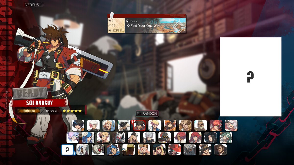
A problem with Strive's original character select is just how unorganized it felt. And to a degree, this made sense. They weren't just going to reorganize the screen with each new DLC character just so that Ky and Sin could be next to each other or something. This problem persists into 2.0's character select, and I doubt it will get any better as new DLC releases. But what if it did?
For the most part, I tried to connect characters that have at least some relation to each other, and tried to keep the most story-relevant characters near the center. I also assumed the mystery character to be Jam, which I think is a fairly easy conclusion to make as discussed elsewhere.
In terms of groups, they roughly take the form of: Baiken's Family -> Assassin's Guild -> Valentines / Sin's Friends -> Kiske Family -> Gear Project -> Time Travellers -> Jellyfish Pirates -> U.S. Government -> Miscellaneous
- The Future? -
Adding New Characters
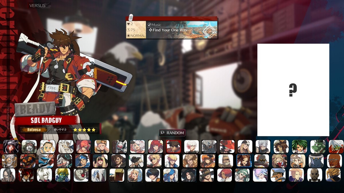
But what about the future of 2.0? We know there will be more characters, so how would this fare if we added more? Here is what the character select would look like if every character in my "Future of Strive" analysis was added:
This includes Jam, Gabriel, Raven, Answer, Haehyun, Zappa, Izuna, Daryl, Justice, Ariels, Fanny, Tyr, Order-Sol, 2Cave, Leopaldon, Robo-Ky, Chronus, Malcolm Myers, Dr. Paradigm, Crow, Judgment, Kliff, Vernon, Robo-Ky MK.II, and Valentine.
I also had to slightly shift the upper and lower rows to prevent two characters from going offscreen.
Reorganizing
Here is a version with better organization, similar to before:
Once again, I tried to keep characters near others they have some relation to. Due to the larger number of characters, not every character is near their most important relations and some less important characters are just placed in the gaps.
In terms of groups, they roughly take the form of: Miscellaneous -> Jellyfish Pirates -> Baiken's Family -> Assassin's Guild -> Valentines / Sin's Friends -> Kiske Family -> Gear Project -> Crusades -> Time Travellers -> "Leaders" + Assistants -> Faust's Group